Butternut AI
Closing the gap between generate and publish
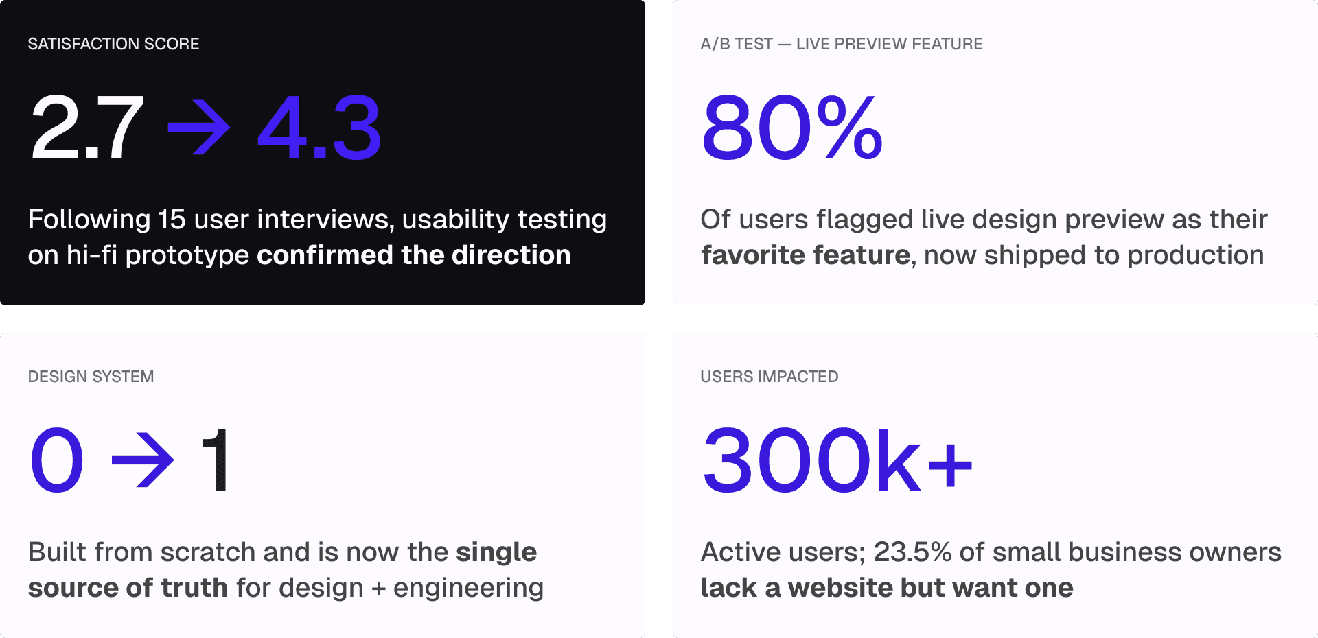
Redesigning the AI editor for a website builder used by 300k+ users, turning a 2.7 into a 4.3 satisfaction score.
ROLE
Lead Product Designer
TOOLS
Figma, FigJam, Google Suite, Slack
TEAM
Product Manager, 5 Product Designers
DURATION
10 weeks
OVERVIEW_
Over 300k users tried it. Fewer than 15% published.
Butternut AI lets small business owners build a website from a single text prompt in just 20 seconds. The product had strong traction, but something was breaking down between "generate" and "publish."
When I joined the team as Lead Product Designer, the surface-level ask was to modernize the interface. But the real question was: why were 85% of users abandoning before publishing?
INSIGHTS_
POOR FEATURE DISCOVERABILITY
Users couldn't find the tools they needed. Editing options were hidden, unlabeled, or buried in nested menus.
AI FELT LIKE A BLACK BOX
AI Assist would reply "Changes Done" with no explanation. Users couldn't tell what changed, or how to course-correct.
INCONSISTENT, OBSTRUCTIVE UI
Editing tools appeared as popups that blocked the canvas, making it impossible to see changes in context as they made them.
PROMPT INPUT HAD NO SCAFFOLDING
A blank text box gave users no guidance on what to type, leading to vague prompts and underwhelming first-generation results.
CHALLENGE_
How might redesigning Butternut AI improve the website editor experience and usability of AI to help non-technical business owners effortlessly and confidently design a website they're proud to publish, without needing to know terms like "border-radius"?
SOLUTION_
Understanding the landscape
Before jumping to solutions, we mapped the competitive landscape to understand where Butternut sat relative to alternatives.
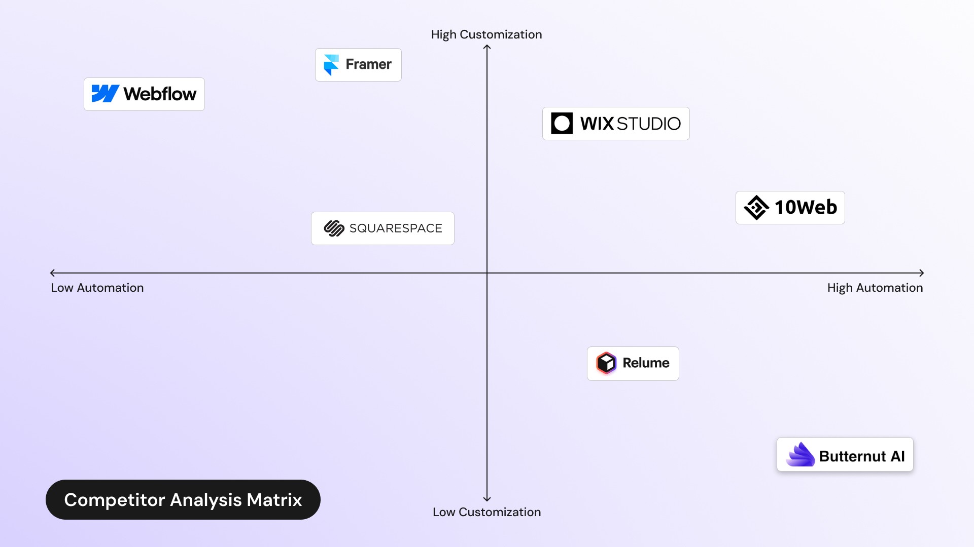
Butternut had carved out a unique position: high automation, low customization, prioritizing speed over flexibility. The opportunity wasn't to add more features. It was to make the existing ones actually usable.
The blank prompt box was setting users up to fail
Butternut's initial generation used a ChatGPT-style text input. A blank text box asks a lot from someone who has never built a website before. Users could easily imagine what they wanted their site to look and feel like. They just didn't know how to express it in terms that Butternut's AI could interpret.
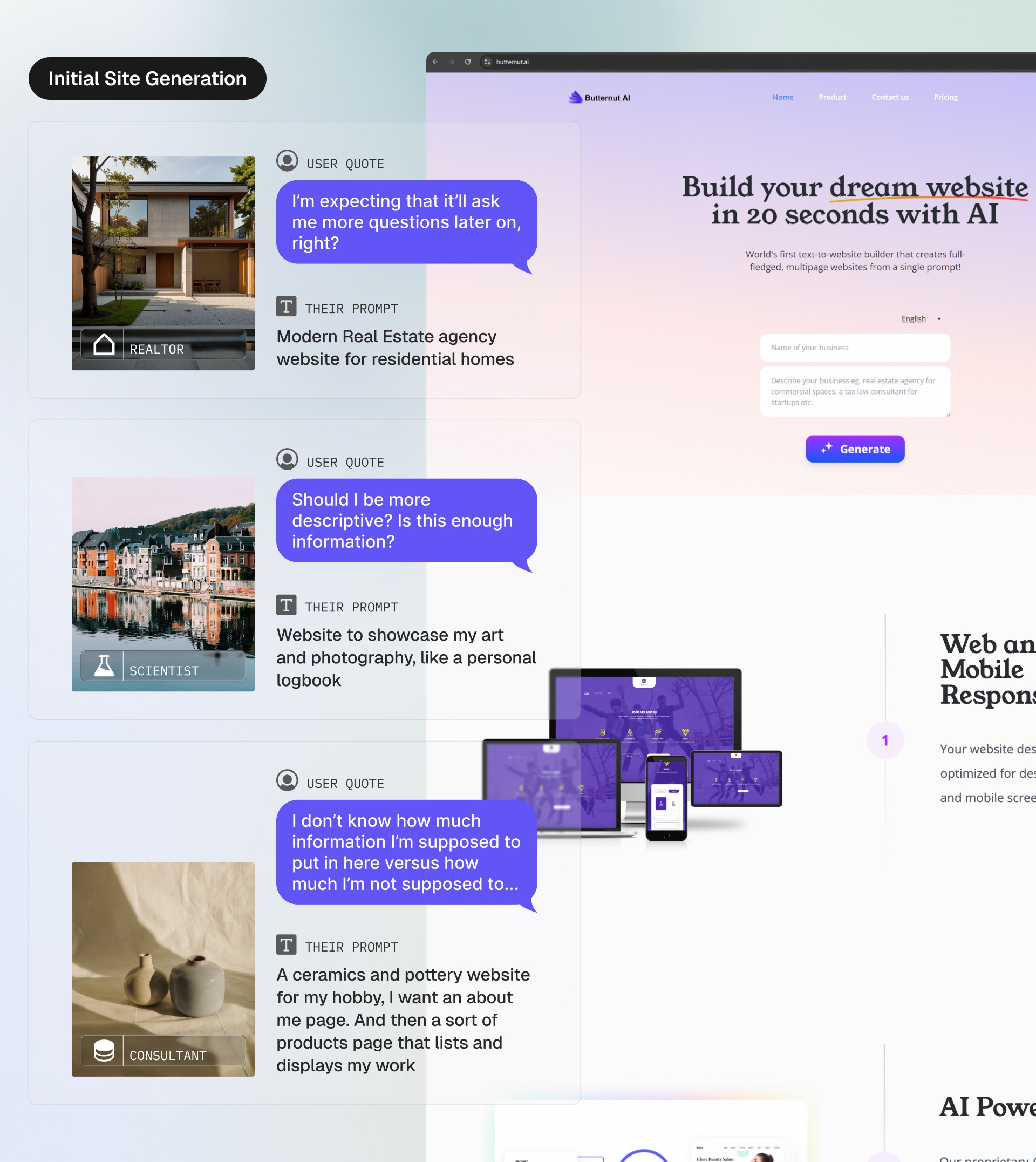
I added example sites to Butternut’s landing page with editable prompts. This accomplished two things: it showed users the range of what Butternut could create, and clarified the type of prompt that produces good results.
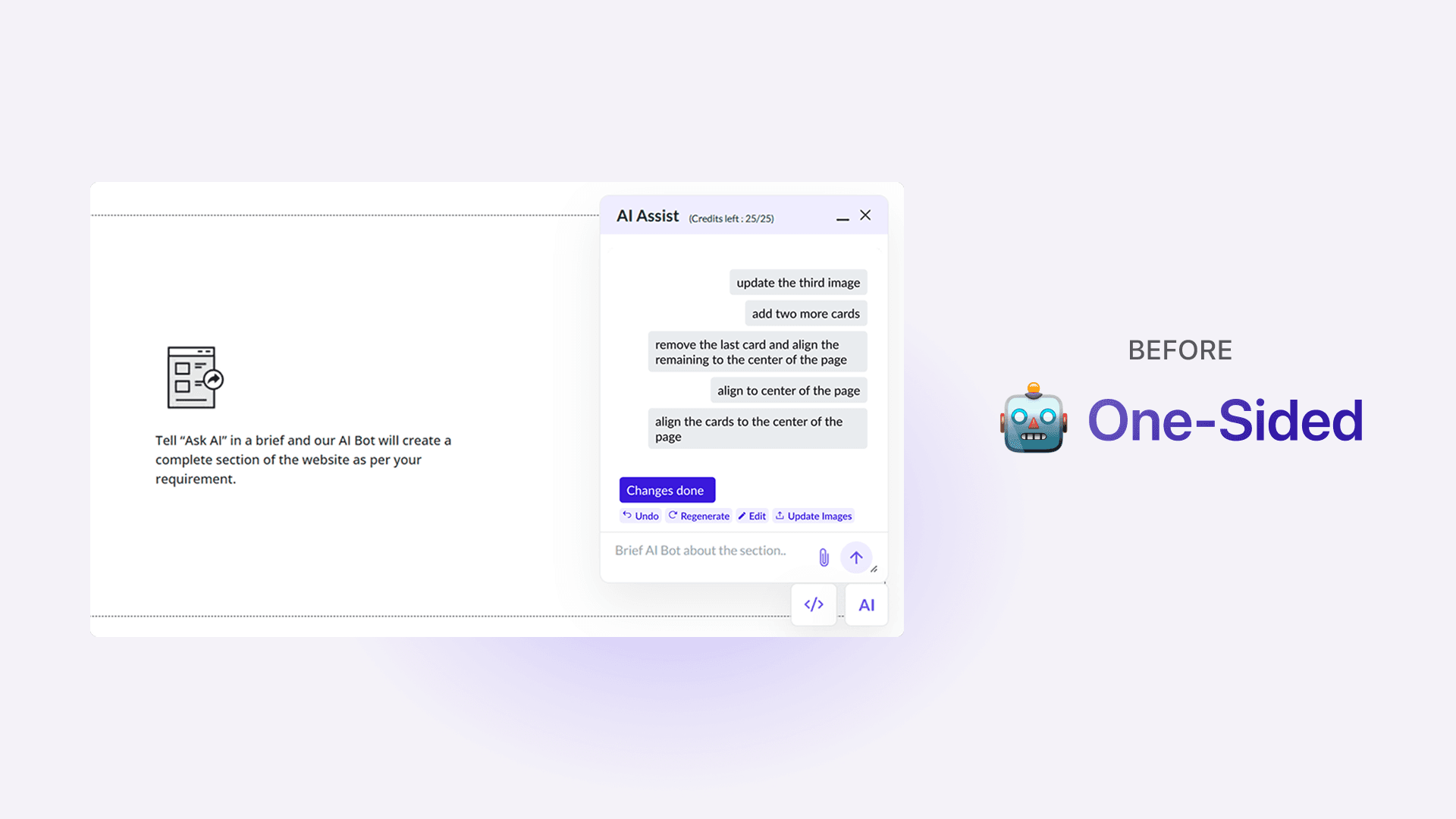
AI Assist felt like talking into a void
Another core feature at Butternut is AI Assist, a chatbot that lets users enter prompts to build and edit website sections. However, many users didn’t notice this feature, and those who did often found it confusing. Interactions felt one-sided, as AI Assist would reply “Changes Done” after users entered prompts without showing what had changed, leaving it unclear which edits were applied.
After multiple iterations, AI Assist now responds conversationally, giving real-time feedback and clear explanations of its actions. A library of prompt examples and live suggestions was also added, to guide users.

One toolbar doing too many jobs
The original editor had a single top toolbar whose actions changed depending on what was clicked — without any visual indication that this was happening. Other tools appeared as pop-ups, covering the canvas during editing.
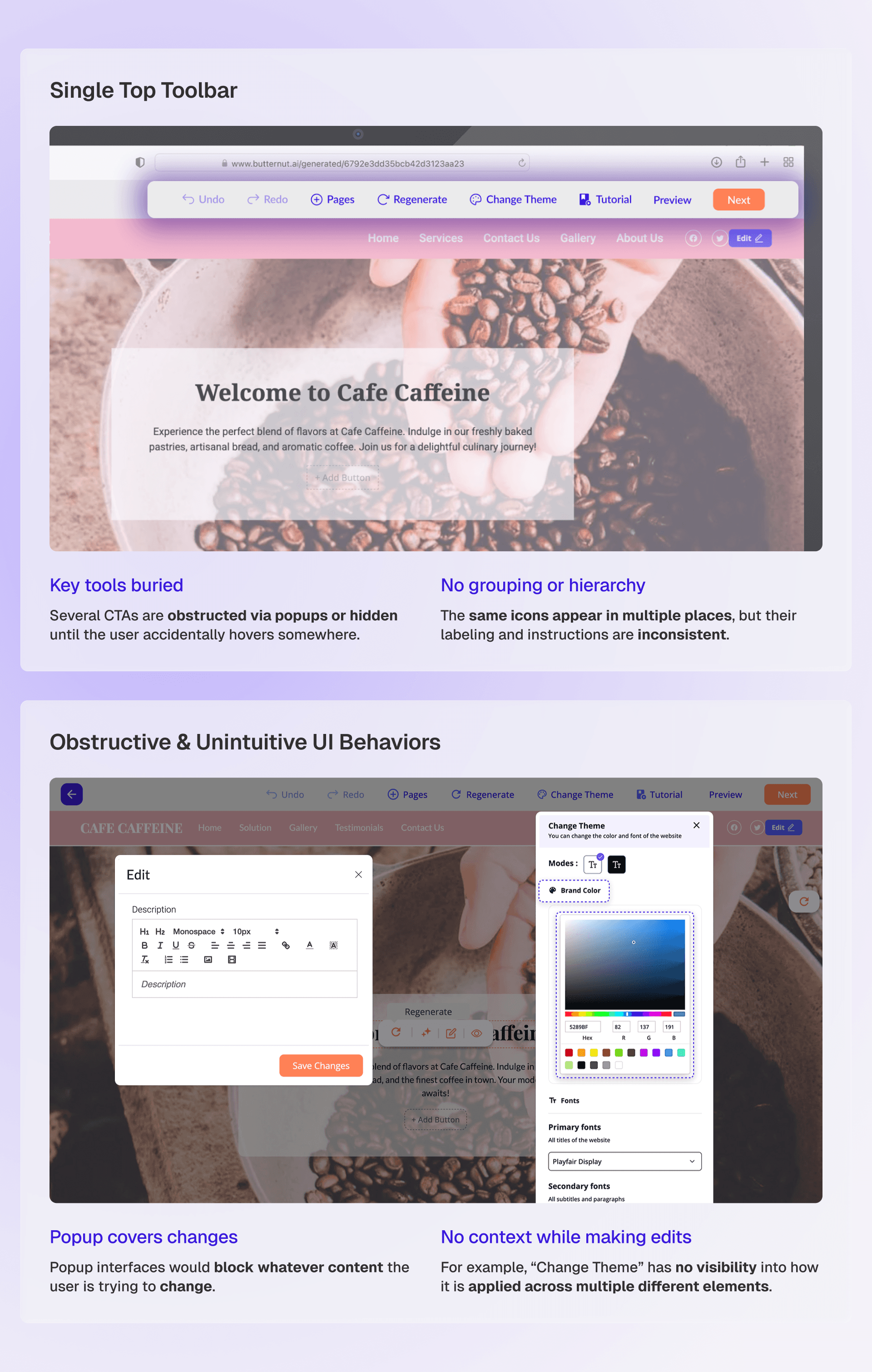
The client wanted to preserve the feeling of "editing directly on the site." So rather than moving everything to a collapsible sidebar, I introduced a clear separation between two types of tools: Universal and Contextual.
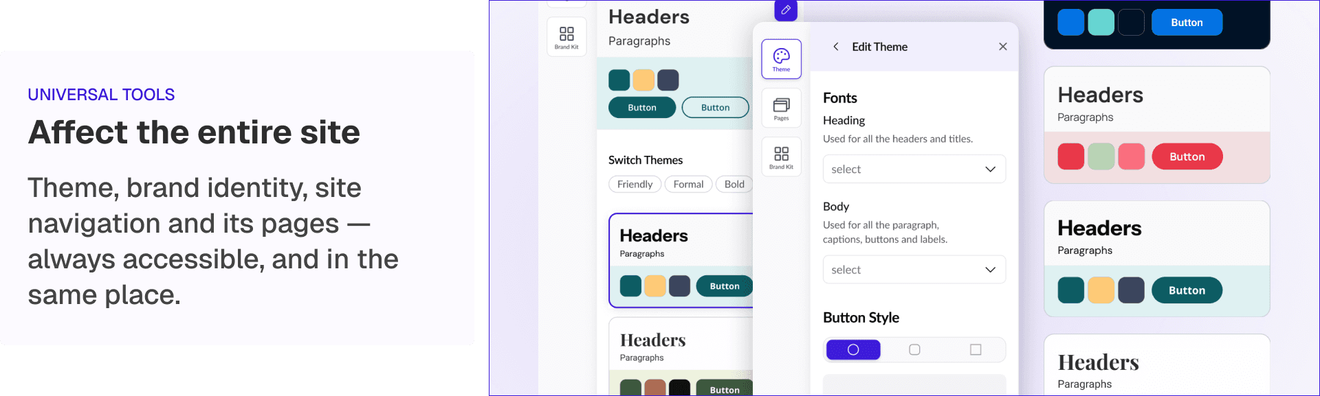
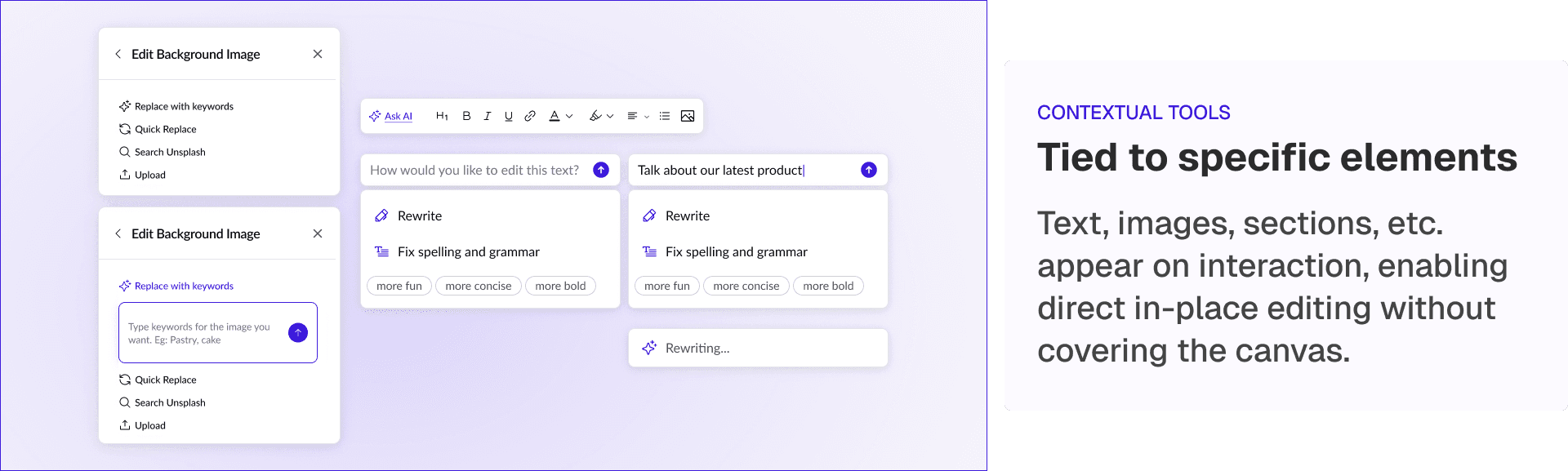
On-object UIs were also redesigned to be draggable, so users could reposition them without losing sight of what they were editing.
The top bar was redesigned to handle site management and navigation, including accessing the home dashboard, switching projects, and publishing the site.

TAKEAWAYS_
Measurable improvement, and a foundation for scale
Building the system that didn't exist
At the start of the project, Butternut had no formal design system - it all existed in one designer's head. Inconsistencies were everywhere: similar pages used completely different layouts and components.
To address this, I identified inconsistencies across the product’s UI and created a token-based system with documented components, spacing, and color logic. This became the single source of truth for both the design and engineering teams going forward.
If I had a few more weeks
01 — Expand AI Assist capabilities
More nuanced prompt interpretation, multi-step edits, and undo/redo awareness so that users can experiment without fear.
02 — Deeper engineering collaboration on publishing flow
The drop-off between editing and publishing is still the core business problem. A dedicated audit of that final step, with engineering input on technical blockers, would be my next focus.